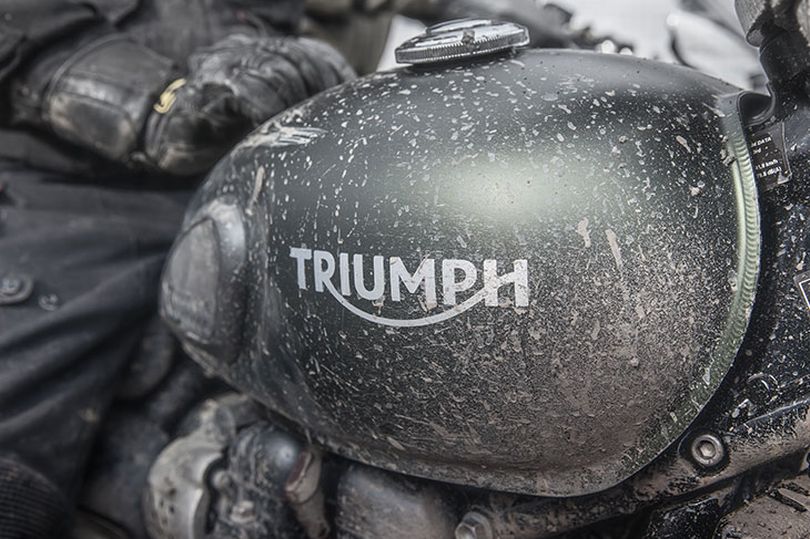
by Fraser Addecott from https://www.mirror.co.uk
Instantly recognisable around the World, the Triumph logo has has many guises over the years, each one providing a reflection of the mood of the time it represented
Think of the most iconic names and brands in motorcycling and Triumph must surely be near the top of that list.
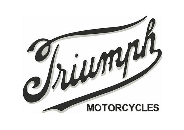
The instant recognisable logo, with the swoop of the “R” running through to the “H” – known as the “smile line” – is familiar to all bikers.
What may not be so well known is that the branding has had numerous guises, reincarnations, redesigns and tweaks over the years, all reflecting the mood and culture of the time.
Mirror Motorcycling spoke to Miles Perkins, Triumph’s head of brand management and previously part of the design team at global brand consultant Wolff Olins, which created the recent triangular iteration of the logo.
Miles says: “For me, the Triumph logo represents an incredible history and attitude.
“It generates a great deal of reverence and passion from fans all over the world, something the team took very seriously when carefully developing the latest version of this iconic mark.
“The creation of the new badge with its Union Flag detailing and Triumph logo was inspired by the original maker’s mark engine-badge triangles from the 1930s, and was first sketched out at the factory with the Triumph engineering team.”
Miles confesses he doesn’t have that original hand-drawn sketch any more.
“I’m kicking myself,” he admits, “as this would have been a wonderful memento.’’
But he does have an intimate knowledge of the famous branding.
“The logo is synonymous with the passion and independent attitude that the bearer shares,” Miles says.
“The likes of Steve McQueen, Bob Dylan and Bruce Springsteen, who all wore T-shirts bearing the logo, helped make it a metaphor for style, individuality and fashion.”
The first Triumph motorcycles were produced in 1902 at a factory in Coventry, owned and run by Siegfried Bettmann.
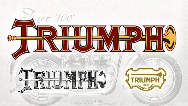
Miles says: “One of the very first logos had a slightly religious leaning about it, the trumpet possibly signifying the triumphant fanfare at the gates of heaven.
“Those early bikes gained the nickname Trumpets from their owners.”
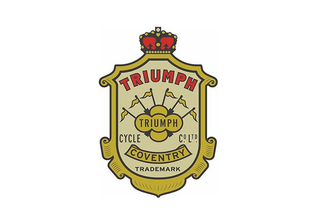
From 1902 to 1906, the firm used a somewhat imperialist-looking crest badge, featuring flags and the Coventry name.
The first script design appeared in 1907 and was used until 1922.
Miles says it “sought to make Triumph appear less of a faceless manufacturer and more approachable, by making the firm’s voice more personal, stressing the emphasis that was put on human craft, care and engineering”.
But in 1922, the company reverted to a badge.
Miles explains: “After the First World War, faith and trust in British products was a major selling point for firms based in the UK, and Siegfried Bettmann strengthened that message with an evolution of the old crest design.
“He recognised that Coventry was the then silicon valley of the bike world and added red, white and blue to the patriotic mix as well as emphasising the links with the city.
A page featuring a map of the world was briefly used in 1932/33, before a return to a script.
Miles says: “Advertising was becoming an altogether more sophisticated art and the idea that branding was about delivering a clearer message on quality and personal choice came increasingly to the fore.
“This was the start of the age of the science of brand with the advent of television so the logo, with its distinctive smile line, was born.
“The T in Triumph was drawn to symbolise the piston in an engine’s cylinder head while the serif font and sweeping line from the R to the left of the H were very much the design flavour of the day, bringing a more instantly recognisable human touch taking the lead from Victoriana and Art Deco.”
The design was used from 1934 all the way to 1990.
At that point, the firm went into receivership and was then reborn under John Bloor.
“The logo needed another evolution that reflected the amazing renaissance of the business and the energy of the motorcycle boom of the 90s,” says Miles.
“Every element of the logo was sharpened up a little and the smile line brought to the front of the H to give it more balance, reflecting the new-found strength and stability of the brand.
“In line with the design style of the day, it became a more solid, modern and symmetrical logo to be trusted.”
That version was updated slightly in 2005, before a redesign and the introduction of the triangle in 2015.
This incorporated the Union Flag, the logo and the timeless shape of the original engine makers mark that first appeared with patent details on the engine casing of 1939 Speed Twins.
Miles adds: “Most motorcyclists who ride big bikes would certainly know the Triumph logo and continue to associate it with an incredibly rich history, technical excellence, and of course British engineering.
“Our challenge, as those who came before us who have shared custodianship of this incredible brand, is to make sure that as times change, the brand continues to evolve to reflect today’s riders and their passion.’’
